

 Here’s a scenario most local service business owners know well.
You’ve invested in local SEO. You’re running Google Ads. You show up when people search for what you do in your area. The traffic is there – or at least better than it was. But the phone isn’t ringing the way the numbers say it should be.
The instinct is to spend more on traffic. More ads, better targeting, another content push. But if the site itself is the bottleneck, more traffic just means more people hitting the same friction points and leaving.
That’s the part that rarely shows up in a report: the quiet, steady leak of motivated buyers who arrived, looked around, couldn’t find an obvious next step, and left to call someone else.
The problem isn’t traffic. It’s the path.
88% Won’t Come Back — And They Usually Don’t Say Why
Research consistently shows that 88% of users won’t return to a website after a poor experience. In local service categories – where a homeowner searching for a plumber, an HVAC technician, or a lawn care company is scanning two or three options in under a minute – that single poor experience doesn’t just lose a visitor. It hands the job to whoever’s next on the list.
What makes an experience poor isn’t always obvious. It’s rarely a broken page or an outdated design. It’s subtler: a homepage that doesn’t immediately confirm what the business does. A form with too many fields. A phone number buried in the footer. A site that takes five seconds to load on a phone. Individually, these feel minor. Together, they compound – and the visitor leaves before they ever reach the decision to contact you.
For businesses investing in any form of marketing to drive traffic, this matters a great deal. Every dollar spent sending someone to a site that doesn’t convert is a dollar that returned nothing. The traffic investment is gone whether they call or not.
What Website Friction Actually Looks Like
 Friction is any resistance that slows or stops a visitor from taking the action you want them to take. It doesn’t have to be dramatic. It just has to create enough hesitation that they stop moving forward.
The most common friction points on small business websites:
- Unclear opening headlines – the page doesn’t immediately confirm it’s relevant to what the visitor was searching for
- Multiple competing calls to action – five options presented equally creates decision paralysis, and the visitor often chooses none of them
- Navigation that adds decisions – too many menu items, nested dropdowns, unclear paths to the contact page
- Long contact forms – every additional field introduces measurable drop-off; asking for information that doesn’t help the first conversation is friction disguised as thoroughness
- Slow load times, especially on mobile – visitors who don’t see content within three seconds leave before reading a single line
- Absent or misplaced trust signals – leaving a visitor uncertain about whether this business is credible and worth contacting
None of these kill a business on their own. But a site carrying four or five of them is quietly underperforming on every marketing dollar that points to it.
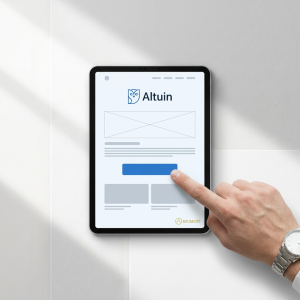
The Four Elements of a Conversion Path That Actually Works
A conversion path is the intentional route a website guides a visitor along – from landing to taking action. Well-built sites don’t leave that journey to chance. Every design decision serves one question: does this bring the visitor closer to contacting us, or does it create distance?
1. Headlines That Confirm Relevance Immediately
Visitors decide within a few seconds whether they’re in the right place. A headline like “Calgary’s Trusted Lawn Care Professionals” does three things at once: names the service, names the location, and signals credibility. A headline like “Welcome to Our Website” does none of those things.
The job of the headline isn’t to be clever. It’s to answer the visitor’s unspoken question – “Is this the right place for what I need?” — before they start second-guessing. Clarity there reduces drop-off at the most critical moment in the journey.
2. One Primary Action – Not a Buffet of Options
Pages with multiple competing calls to action are among the most common conversion killers on small business sites. When a visitor sees Call Us, Get a Quote, Learn More, View Our Portfolio, and Subscribe to Our Newsletter on the same page, they don’t pick one. They pick nothing, because the cognitive effort of choosing becomes its own friction.
One clear, prominent primary action – Request a Free Quote or Call for Same-Day Service – removes the ambiguity. It tells the visitor exactly what to do next. Secondary paths can exist, but the hierarchy should be unmistakable: one dominant action, everything else subordinate to it.
3. Navigation That Removes Decisions
Every additional choice point in a site’s navigation is an opportunity for a visitor to go somewhere other than your contact page. For local service businesses, simplified navigation typically means five to seven items at most, no nested dropdown menus, and a clear path from any page to a service page and from a service page to the contact form.
The goal isn’t a stripped-down site – it’s a site that never makes a visitor feel lost or uncertain about what to do next.
4. Forms That Get Out of the Way
Reducing the number of fields in a contact form consistently increases completions. This isn’t a nuance – it’s one of the most replicated findings in conversion rate optimization. A ten-field form produces meaningfully fewer submissions than a four-field form, even from the same traffic.
The minimum viable form for most service businesses is three fields: name, phone number, and a brief description of what’s needed. Every additional field should earn its place by genuinely helping qualify the conversation – not just because it might be useful to have on file.
One real example: cutting a ten-field form to four fields increased completions by over 150% for a client. Same traffic, same offer, same page — just fewer obstacles between the visitor and the inquiry.
Mobile Performance Is a Lead Generation Issue
More than half of all internet traffic comes from mobile devices, and in local service categories, that number is often higher. A homeowner who notices a leak or a lawn that needs attention is almost certainly reaching for their phone first. If the site they land on isn’t built for that experience, the lead is gone before it starts.
A one-second delay in mobile page load time can reduce conversions by up to 20%. Google’s data shows that 53% of mobile visitors will leave a page that takes longer than three seconds to load – before reading a single word of content. Meeting Google’s Core Web Vitals performance standards has been shown to reduce site abandonment rates by up to 24%.
Mobile-first design in practice means:
- Large, tap-friendly CTA buttons – no precise finger placement required
- Click-to-call phone numbers that dial with one tap
- Vertical layouts without horizontal scrolling or pinch-zooming
- Load times under three seconds on variable mobile connections
- Short forms that are easy to complete on a touchscreen keyboard
For service businesses in suburban and semi-rural areas where connectivity can be inconsistent, lightweight, fast-loading pages aren’t a nice-to-have. They’re what determines whether a high-intent buyer who’s searching from their driveway actually reaches you or moves on.
Trust Signals Bridge the Gap Between Interest and Contact
A visitor can be completely convinced by a service offering and still not reach out. What stops them, more often than people realize, is doubt. In local service categories – where the decision often involves inviting someone onto your property – that doubt has real weight.
Trust signals are the independent evidence that other people have made this decision and had a good experience. Roughly 75% of people judge a company’s credibility based on its website design alone, meaning a visually inconsistent or outdated site can eliminate a business from consideration before a single service is evaluated.
The placement matters as much as the presence. A testimonial positioned beside or just above the primary call to action does significantly more work than one buried at the bottom of a page. At the exact moment a visitor is deciding whether to submit a form or pick up the phone, a visible, specific review from a real customer is what tips the balance.
The most effective trust signals for local service businesses: named testimonials with specific outcomes (“The crew arrived on time, completed the job in one day, and left the property cleaner than they found it”), Google Business Profile review widgets that show live ratings, and before-and-after project photography.
One point that’s worth adding in 2026: Your website isn’t just read by people anymore. AI tools like ChatGPT, Gemini, and Perplexity are actively pulling from websites when they form recommendations for local businesses. A site with credible trust signals, clear service descriptions, and professional presentation is a site that both people and AI recognize as a credible source. That’s not a separate problem to solve — it’s the same one, with higher stakes.
The Math That Changes the Conversation
This is the part that tends to surprise business owners the most.
When leads are slow, the instinct is to spend more – more ads, more SEO, more social. But if the site is the bottleneck, more traffic doesn’t solve the problem. It just means more people hitting the same friction points and leaving.
Consider the difference: a site receiving 500 monthly visitors at a 3% conversion rate produces 15 leads. The same traffic at 7% produces 35. More than double the leads, from the exact same number of visitors, with no increase in traffic spend.
Improving conversion rate – through clearer headlines, a single primary CTA, shorter forms, faster load times, and better-placed trust signals — can outperform a significant increase in traffic budget. In markets where ad costs are rising and margins are tighter, that efficiency is what separates businesses that are scaling from ones that are spinning.
And as visibility grows over time through local SEO and AI recommendation, a higher-converting site means every new visitor is more likely to turn into a real inquiry. The traffic does more work. The system gets more efficient without getting more expensive.
The website doesn’t need to be rebuilt from scratch. It needs to be evaluated honestly – friction identified, the conversion path clarified, and the path between visitor and contact made as short as possible. Often the changes that drive the biggest results are straightforward: one fewer form field, one stronger headline, one trust signal moved closer to the call to action. Small adjustments to the path compound into real business growth.
What This Looks Like as a System
 At &Summit, we think about website design as one layer of a larger lead generation system — not a standalone project. A site that converts well is the anchor. But it works best when it’s surrounded by consistent trust signals across your Google Business Profile, review presence, and directory listings. When all of those reinforce the same story, every visitor who arrives from any source — search, referral, social, AI recommendation – lands somewhere that builds confidence fast and makes the next step obvious.
That’s what a conversion-focused website is really doing: turning the attention you’ve already earned into action.
If your site isn’t doing that consistently, we build websites specifically for local service businesses that are designed to generate qualified leads — not just look professional.
&Summit helps local service business owners build the digital ecosystem that makes them the obvious choice – for buyers and for AI. Learn how the Customer Activity Method works.